All has gone down well over the past 12 months, so thanks to all at PLP Phil .R
Thank you so much for my invites – I love them! And thank you so much for folding the outers for me 🙂 that’s saved me a lot of time! I really appreciate it, it’s really kind of you. Eloise.L
By the way the Academy brochure you did for me went down really well. Dan.C
The flyers look amazing, thank you so much for all your hard work on it and the quick turnaround.Nat.G
Brochures arrived today and look fantastic! Thanks again for such a quick turnaround Josh.N
A massive thank you for the folders we just received this morning, They look absolutely stunning . Well done! Tom. D
The booklet look super smart and I’m really pleased. So happy. Thanks to Tim for the spot on match on the yellow. Bridget. L
The schools flyer has arrived in and it looks great. Thanks for doing such a great job and getting it here early. Wendy. R
Just to say thanks for a nice clean job and to all of you at Park Lane Press for all your help throughout the project. Lydia. T
Thanks for the Autumn Performance Guide print – really pleased with the job, and it went down really well at our event yesterday. Fiona.M
Many thanks for the fabulous stationery. We are delighted as usual. Thank you also for the care and attentive service that Park Lane deliver! Hopefully we will giving away lots of the delicious new business cards at the Listed Property Show this weekend. Wendy T.
Yes, they’re all here and look great Jess P.
Thank you so much for the boards, they are perfect. Paula P.
Great, thanks Marc – I’ve had delivery of the file copies this morning. They look great 🙂 Gemma B.
Yep we’ve got them, they look fantastic Chris B.
Thanks for your help with the reports for our House of Commons event! Katy B.
Got our catalogues – everyone is happy. Thanks for doing a good job! Phil F.
Thank you the cards have arrived safely and are looking great Ute D.
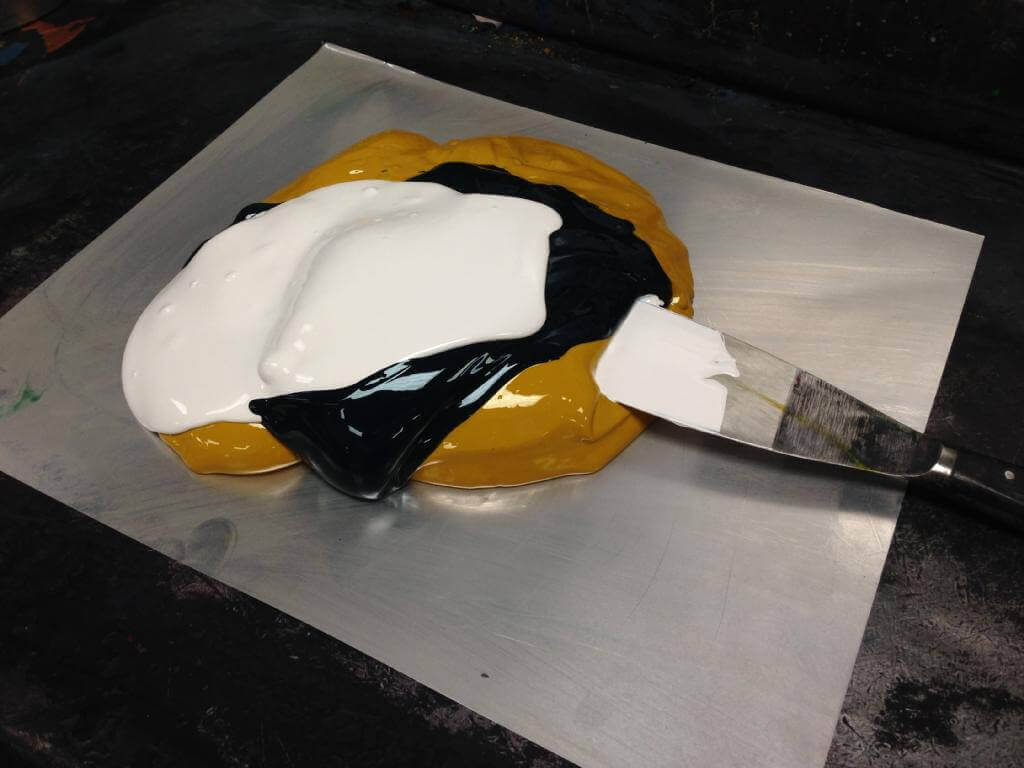
Accurately mixing an ink to a specific pantone colour is certainly an art. In this case we are mixing pantone 375 a green. As you can see blue and yellow weighed to the correct proportions should hit the colour correctly, but at Park Lane we also add other colours or additives to make it print better or improve the match to the pantone book. In this case we have added opaque white which produces a better lay down of solid ink. For 25 years we have been mixing inks and have a huge database of formulas, its the extra touches that make the difference, a bit like baking!
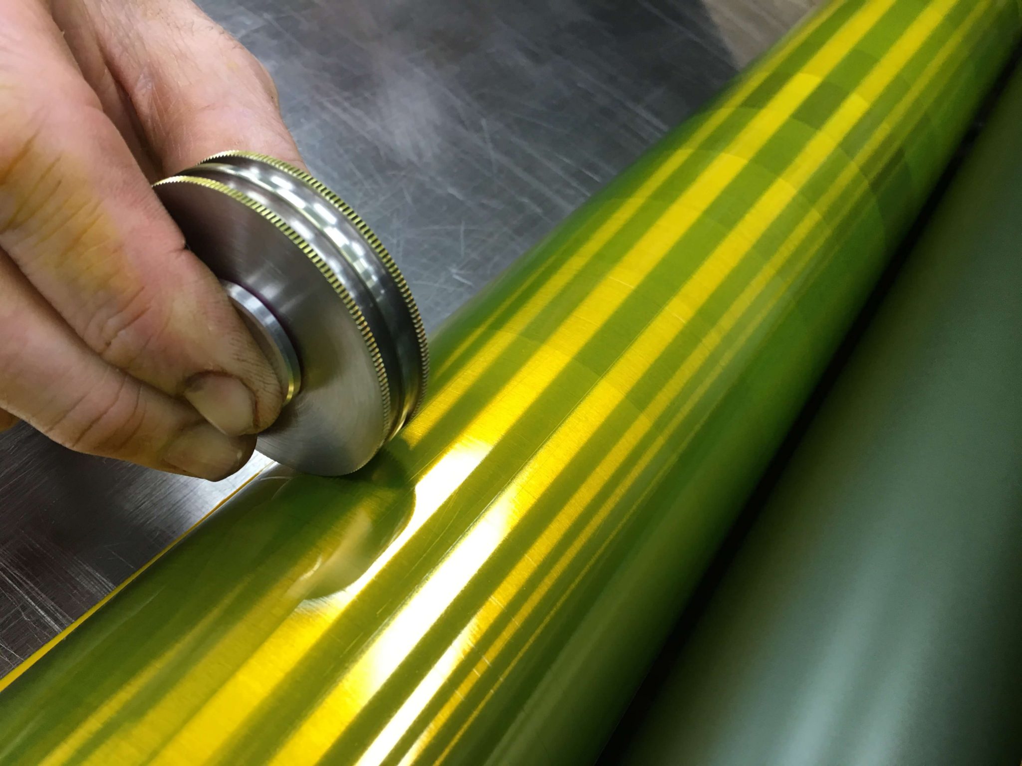
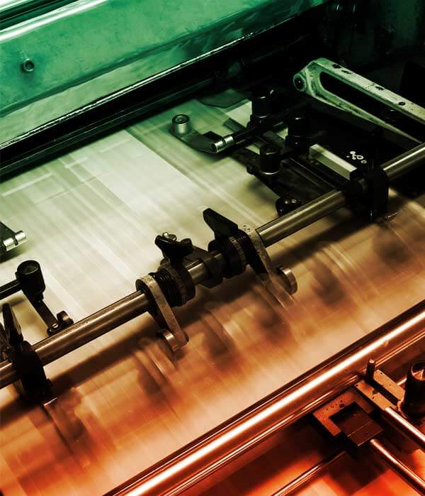
Printing using the waterless process requires the printing press to be maintained to the highest of standards, in order that it can be operated to an expected quality and consistency, which is then translated onto the printed sheet. Today new rollers have been installed in the yellow unit, and the unit is in its final stages of re-calibration.
The ink film thickness on the duct roller has to be set at its minimum of 6 microns. This little gadget (in the image) reads the thickness to ensure that the ink applied to the new rollers is accurate.
It is imperative that this measurement is correct to ensure that the printed sheet matches to the Epson proofs quickly, as any variation which adds time and therefore loses efficiencies in the production process.
Other factors that may impact the thickness of the ink film may include air temperature. If the pressroom is cold the ink will become stiffer and less mobile. Air conditioning within the factory provides a consistent working environment, to eliminate these types of variations.
This is a very small part of the maintenance required to ensure that the manufacturing process limits any possible defects. This helps to provide the exceptional quality we work towards – every time.
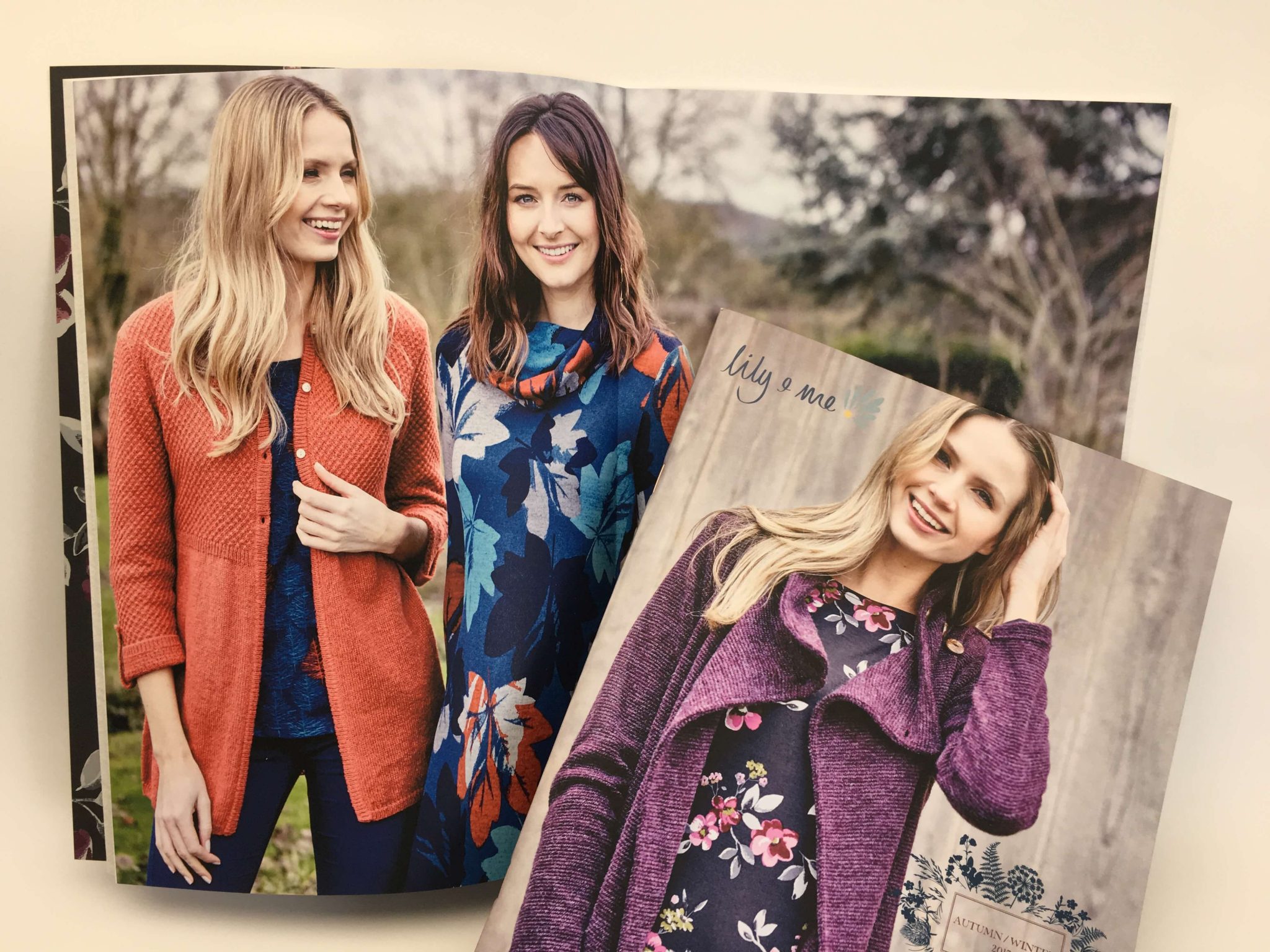
This clothing collection is inspired by rural woodlands, landscapes and gardens and the prints are bursting with beauty and the colour of nature.
Park Lane Press has had the pleasure of producing the brochures for this brand for a couple of years now. The quality photography provides an opportunity for us to show what we can achieve on uncoated stock.
Reprographics
The higher the image dpi the higher the screen ruling we can run to achieve the best results in terms of detail even on uncoated paper. In this instance, we ran to 225 lines per inch, our maximum is 300 line.
Using our waterless process allows us to run a special ink set which lifts the images providing a greater colour gamut, beyond what is normally achieved on a conventional four colour set and towards the original RGB images, giving a life like reproduction even on uncoated.
Finishing and mailing
Even though the brochure has 64pp it has been saddle stitched, great importance is always given to the page creep and we adjust accordingly within our normal protocol to ensure the creep is minimised. Adding a carrier sheet, we polywrap and mail on our Royal Mail account.
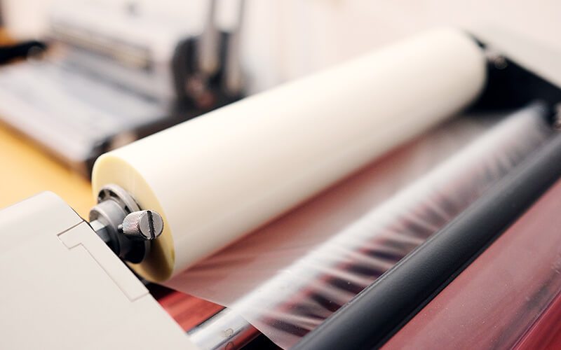
Lamination is a process where a very thin layer of plastic is applied to the surface of paper or card. It helps protect the print beneath. It is also tear resistant and water resistant. Having materials laminated improves wear and tear in terms of handling, and potential damage from the sun
There are several types of laminate available on the market, many of my customers are unsure about which ones to use – here are details of the most common types.
Gloss laminate
This is the most commonly used laminate, generally used for book covers and brochures. This laminate is the cheapest on the market and is extremely durable. It provides lift to the image beneath, as the images become crisper and sharper providing more contrast. The laminate can be easily wiped clean if it gets dirty.
Matt Laminate
Matt laminate is also very popular as it provides a muted finish. It is a softer look and has lower contrast on darker areas. Matt laminate is affordable and is commonly used in conjunction with Spot UV for affect. It has a velvet feel and is nice to handle. The disadvantages of Matt laminate is that it can be easily bruised and scuffed with general handling, making the product look battered pretty quickly. The darker the printed image the more easily this is visible.
Soft touch laminate
This laminate has become very popular in the past couple of years, mainly as it doesn’t mark very easily and it has a matt finish. However the texture isn’t liked by everyone as it feels a bit like chamois leather. This laminate is more expensive than matt.
Anti -scuff matt laminate
This the most expensive of all the laminates listed but it does provide a higher quality product. This type of laminate is best used on very dark areas of print where you want it to remain pristine and have a matt finish.
Spot UV Varnish
This effect isn’t so popular these days. Spot UV varnish is an offline UV application and if it hasn’t been managed properly at the printing stage can have a poor finish. This is due to either “orange peeling” which can occur if too much spray is applied, or fit issues if the print isn’t registered properly. If the UV runs over a fold or a spine it will crack, so please remember this at the design stage. If printed correctly is can provide stunning results.
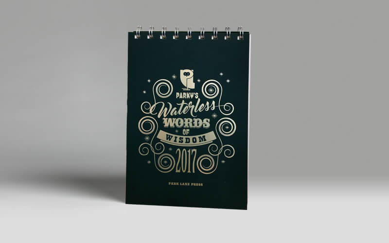
Our 2017 desk top calendar has been distributed and we have had some fantastic feedback. The calendar was printed with 4 colour text and a pantone double hit to the cover and easel, with a anti-scuff laminate to the outer and finished with a gold coloured foil, a truly beautiful piece.
After years of producing landscape wall calendars we felt that it was time for a change and with the move to open plan offices and limited wall space the desk option was the way to go. Les Welch at Lionhouse designed the job spending hours on the detail on each quote that interleaves the months using his creative brilliance. We are all very proud of the finished item. We still have few left should you like one.
Park Lane has installed LED lighting throughout the offices and factory. SMARTech energy consultants used the data collected to produce an energy reduction plan for the business. This plan identified opportunities to reduce energy consumption considerably at the site with a very quick payback on investment, also make significant reductions in carbon emissions. The building layout and the range of activities undertaken demanded different coloured light output in each location. The new lighting solution involved retrofitting the current fittings to LED tubes, installing 600×600 LED panels, flood lights and integrating PIR sensor controls.
🦉
#wordsofwisdom #environmental #sustainability #print #litho #digital #printingservices #lithoprint #digitalprint #waterless #fsccertified #BCorp #EcoFriendlyPrint #SustainablePrinting #environmentalresponsibility #UKPrinted #ProtectThePlanet #ClimateAction #BrightFuture

Take a look at our latest festive project! A beautifully crafted brochure, printed in vibrant four-colour process with a machine coat throughout. Expertly folded and saddle-stitched with two wires for a polished finish 🎄
#print #litho #waterless #digital #printingservices #fsccertified #BCorp #EcoFriendlyPrint #RecycledPaper #SustainablePrinting #QualityCraftsmanship #GreenPrinting #environmentalresponsibility #PlantBasedInks #UKPrinted #BrochurePrinting #SaddleStitch
🦉
#wordsofwisdom #environmental #sustainability #print #litho #digital #printingservices #lithoprint #digitalprint #waterless #fsccertified #BCorp #EcoFriendlyPrint #SustainablePrinting #environmentalresponsibility #UKPrinted #ProtectThePlanet #ProtectNature #BetterTomorrow
Elegant and festive! Christmas cards printed in a single Pantone colour with luxurious gold foiling, paired with white envelopes and finished with a printed belly band 🎄
#print #litho #digital #waterless #printingservices #sustainability #fsccertified #BCorp #ChristmasCards #GoldFoiling #PaperBanding #PantonePrint #CustomStationery
🦉
#wordsofwisdom #environmental #sustainability #print #litho #digital #printingservices #lithoprint #digitalprint #waterless #fsccertified #BCorp #EcoFriendlyPrint #SustainablePrinting #environmentalresponsibility #UKPrinted #ProtectThePlanet #OurResponsibility #LoveThePlanet #ClimateAction
🎄Here`s some Christmas branded wrapping paper, beautifully rolled and secured with paper labelling. Printed with precision on our litho press for a premium finish.
#print #digital #printingservices #DigitalPrinting #fsccertified #BCorp #EcoFriendlyPrint #RecycledPaper #SustainablePrinting #GreenPrinting #environmentalresponsibility #UKPrinted #ChristmasWrappingPaper #BrandedPackaging #PremiumPrint #FestiveSeason #CustomPrint
🦉
#wordsofwisdom #environmental #sustainability #print #litho #digital #printingservices #waterless #EcoFriendly #ProtectThePlanet #GoGreen #GreenLiving #EmpowerChange
Our Kluge in Action! Turning standard business cards into show-stoppers with a custom die-cut shape that stands out. Precision, style, and impact in every cut!
#print #litho #digital #waterless #printingservices #environmental #sustainability #PrintMagic #BehindTheScenes #PrintProduction #QualityCraftsmanship #DieCutting #BusinessCards #StandOut #BrandIdentity #kluge
🦉
#wordsofwisdom #environmental #sustainability #print #litho #digital #printingservices #waterless #OneEarthOneChance #ProtectThePlanet #EcoFriendly #LoveTheEarth #GreenFuture #ClimateAction
Here is one of our latest projects: 120,000 A5, 16-page self-cover booklets, carefully prepared and ready for precision stitching on our Muller Martini. Proud to deliver quality and efficiency at scale 📚
#print #digital #printingservices #DigitalPrinting #fsccertified #BCorp #EcoFriendlyPrint #RecycledPaper #SustainablePrinting #GreenPrinting #environmentalresponsibility #UKPrinted #mullermartini #A5Booklets #saddlestitching
🦉 Happy Halloween from the team at Park Lane Press Ltd!
Wishing you a spook-tacular day 🕸️🎃👻
#wordsofwisdom #environmental #sustainability #print #litho #digital #printingservices #waterless #HappyHalloween #SpookySeason #Halloween2024 #ParkLanePress #TrickOrTreat
Here’s a set of booklets we`ve printed on our digital press and bound with crisp white wire-o binding for a polished, professional finish.
#print #digital #printingservices #DigitalPrinting #fsccertified #BCorp #EcoFriendlyPrint #RecycledPaper #SustainablePrinting #GreenPrinting #environmentalresponsibility #UKPrinted #WireOBinding #ProfessionalFinish
🦉 Trees do more than beautify our world—they clean our air, support ecosystems & combat climate change🌳
#wordsofwisdom #environmental #sustainability #print #litho #digital #printingservices #waterless #fsccertified #BCorp #EcoFriendlyPrint #UKPrinted #PlantTrees #SaveLives
🦉 A cleaner future starts with choices we make today💚
#wordsofwisdom #environmental #sustainability #print #litho #digital #printingservices #lithoprint #digitalprint #waterless #fsccertified #BCorp #EcoFriendlyPrint #SustainablePrinting #environmentalresponsibility #UKPrinted

