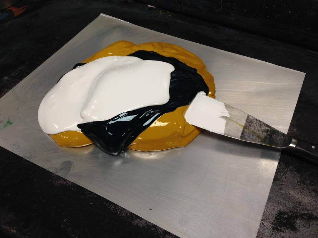
Accurately mixing an ink to a specific pantone colour is certainly an art. In this case we are mixing pantone 375 a green. As you can see blue and yellow weighed to the correct proportions should hit the colour correctly, but at Park Lane we also add other colours or additives to make it print better or improve the match to the pantone book. In this case we have added opaque white which produces a better lay down of solid ink. For 25 years we have been mixing inks and have a huge database of formulas, its the extra touches that make the difference, a bit like baking!
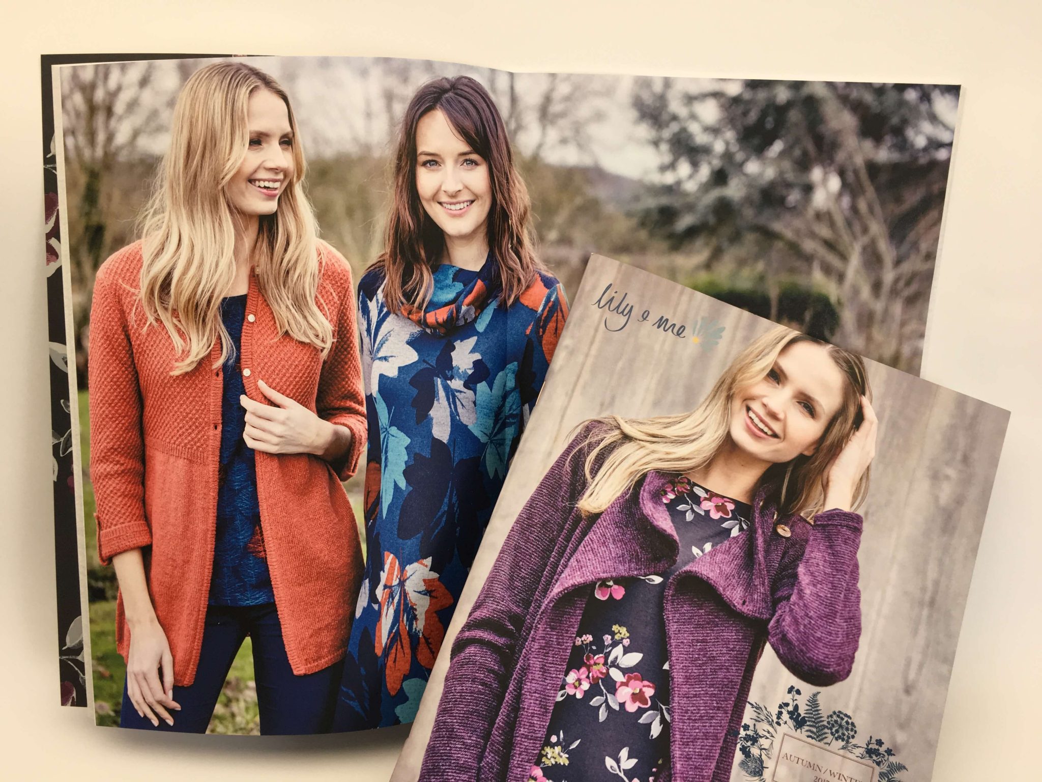
This clothing collection is inspired by rural woodlands, landscapes and gardens and the prints are bursting with beauty and the colour of nature.
Park Lane Press has had the pleasure of producing the brochures for this brand for a couple of years now. The quality photography provides an opportunity for us to show what we can achieve on uncoated stock.
Reprographics
The higher the image dpi the higher the screen ruling we can run to achieve the best results in terms of detail even on uncoated paper. In this instance, we ran to 225 lines per inch, our maximum is 300 line.
Using our waterless process allows us to run a special ink set which lifts the images providing a greater colour gamut, beyond what is normally achieved on a conventional four colour set and towards the original RGB images, giving a life like reproduction even on uncoated.
Finishing and mailing
Even though the brochure has 64pp it has been saddle stitched, great importance is always given to the page creep and we adjust accordingly within our normal protocol to ensure the creep is minimised. Adding a carrier sheet, we polywrap and mail on our Royal Mail account.
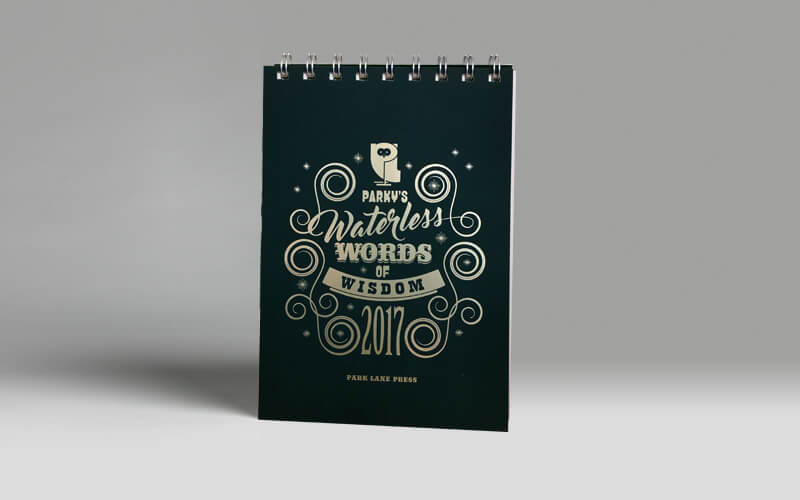
Our 2017 desk top calendar has been distributed and we have had some fantastic feedback. The calendar was printed with 4 colour text and a pantone double hit to the cover and easel, with a anti-scuff laminate to the outer and finished with a gold coloured foil, a truly beautiful piece.
After years of producing landscape wall calendars we felt that it was time for a change and with the move to open plan offices and limited wall space the desk option was the way to go. Les Welch at Lionhouse designed the job spending hours on the detail on each quote that interleaves the months using his creative brilliance. We are all very proud of the finished item. We still have few left should you like one.
Thanks so much for the samples of the brochure – beautifully printed as always – lovely, rich colours. And thanks for turning it around so quickly Sarah M.
The brochures arrived today, they look great. Thank you for seeing this project through. Geoff C.
I have just received the printed copies of the brochure and it looks great – thats for all your help on this Matt C.
The booklets have arrived and they are lovely! thank you! Ruth B.
Just wanted to say a huge thank you for the prospectuses. They arrived safe and sound earlier today and we’re all very impressed with them. I’ve already taken a few copies to show my mum – a true sign of quality! 🙂 – Ben R.
Very happy client. Fantastic work thank you very much – Scott G.
Postcards and wallets arrived yesterday, really delighted with them! Park Lane have been great. – Kerrie B.
The calendars have arrived and look great. Many thanks indeed for such a prompt and efficient service. – Phil H.
Thank you for your support of this event, it is very much appreciated – Saltford School
Thanks – they’re all with us now and looking great – Selma W.
Many thanks for the brilliantly printed books and the great service, I have often been disappointed when I’ve seen my work in print but not this time.– Jane B.
The Unlimited publication looks amazing! We’re so pleased with it. Thanks for all your hard work in getting it to us on time, at a high quality, and with patience. – Jennifer T.
Its refreshing to see a client use a material that is adventurous, in this case its a cover going off to be foil blocked, the text has a similar colour throughout the document which is printed so I can’t wait to see the finished result
There are plenty of mid-range papers that can add value to a job at a reasonable price, without going to the high end paper suppliers, after all once the printer has covered the paper in ink and applied an aqueous seal to the print any reference to the original paper stock can be lost.
Many clients are attracted to off-white papers or cream stocks, these stocks are also sold at a premium. If the time is allowed we can experiment with various tints to achieve the desired colour by printing and can do this with no cost, negating the need for the expensive options.
We regularly print a 3% tint of yellow to achieve a cream background and can also achieve tints of grey and other specified shades. On occasions we have actually scanned a paper sample which may have a pattern, and with careful cloning at the reprographic stage achieve an impressive background.
If you would like to see some samples please do email me [email protected]
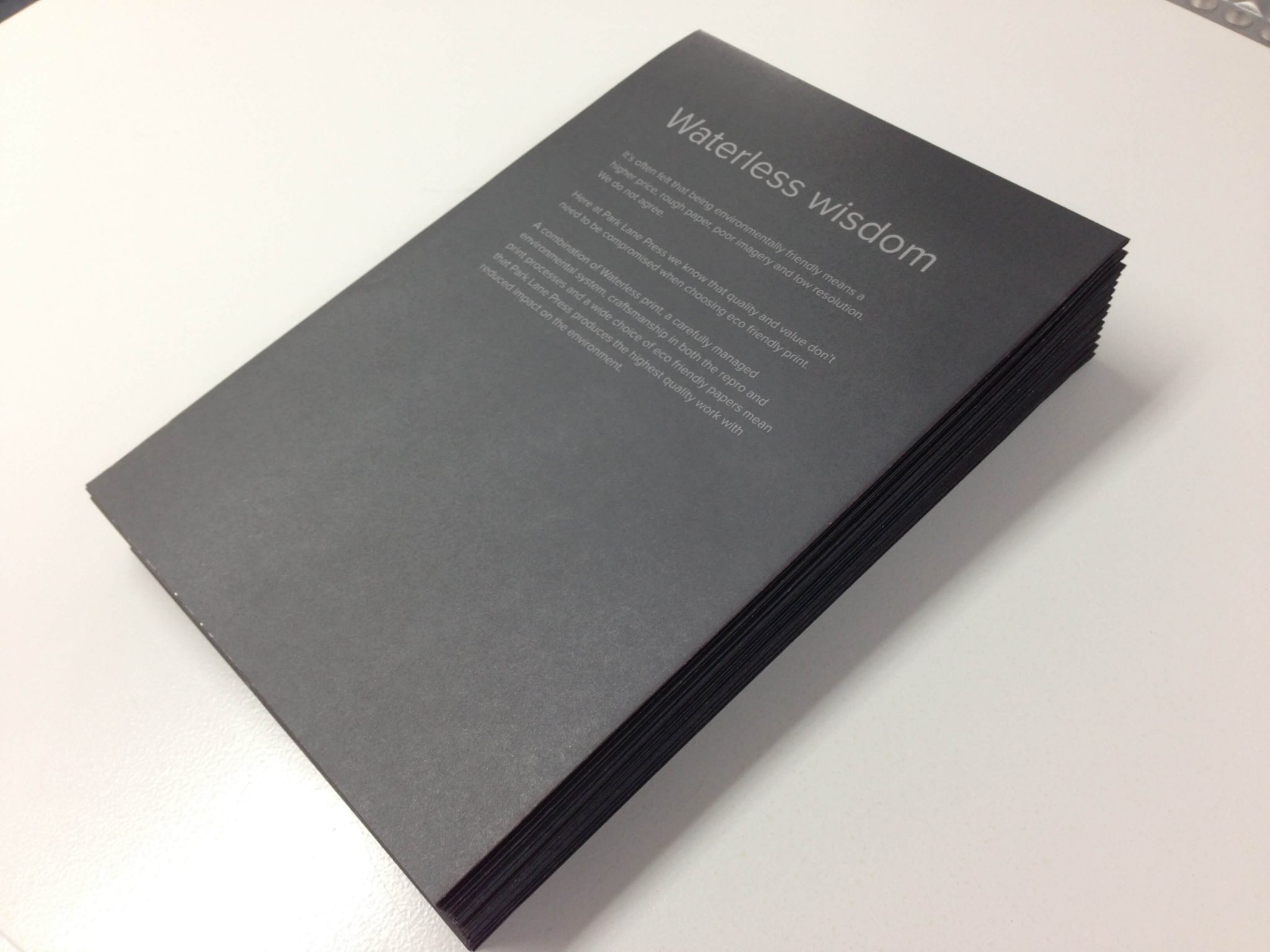
🦉
#wordsofwisdom #environmental #sustainability #print #litho #digital #printingservices #lithoprint #digitalprint #waterless #fsccertified #BCorp #EcoFriendlyPrint #SustainablePrinting #environmentalresponsibility #UKPrinted #ProtectThePlanet #ClimateAction #BrightFuture

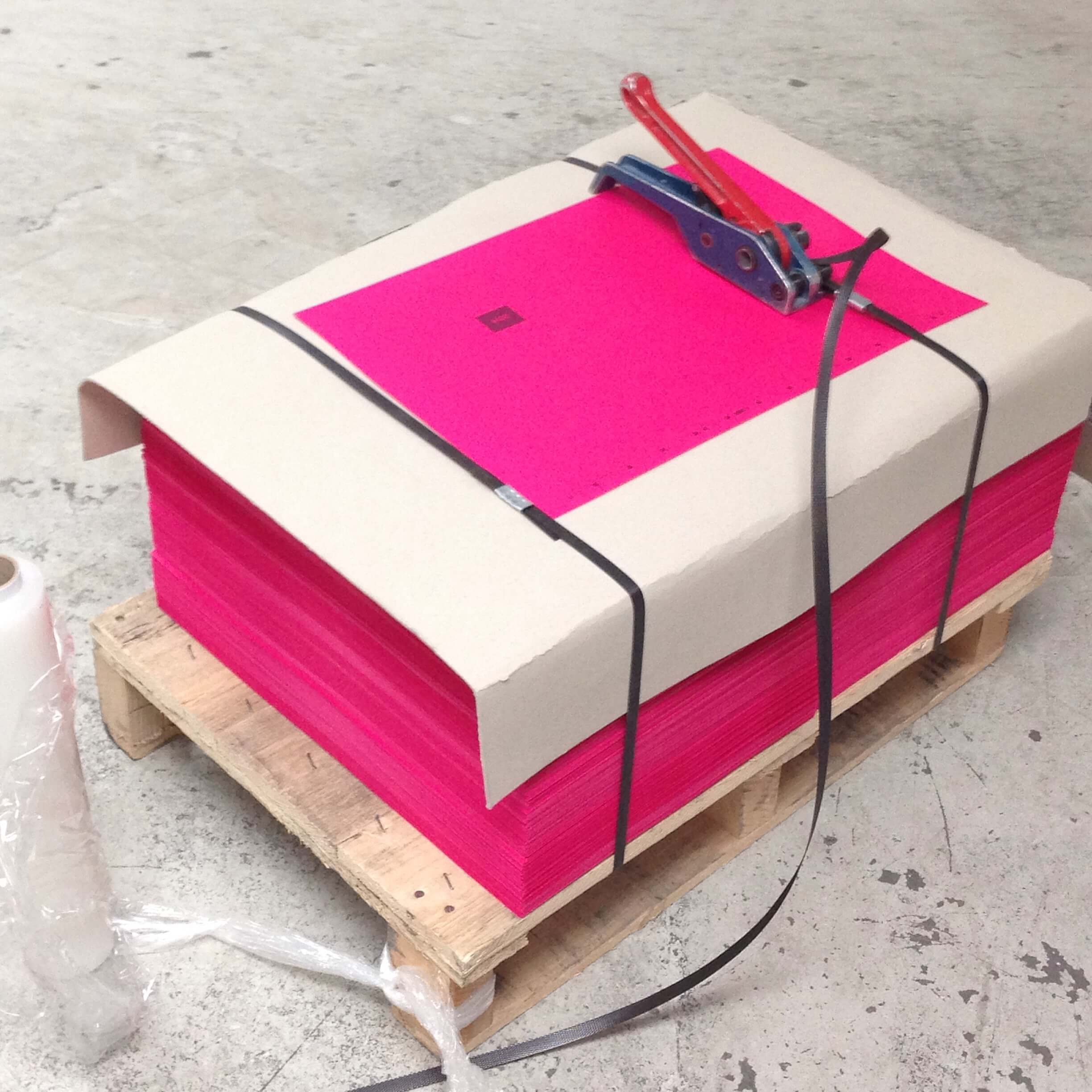
Take a look at our latest festive project! A beautifully crafted brochure, printed in vibrant four-colour process with a machine coat throughout. Expertly folded and saddle-stitched with two wires for a polished finish 🎄
#print #litho #waterless #digital #printingservices #fsccertified #BCorp #EcoFriendlyPrint #RecycledPaper #SustainablePrinting #QualityCraftsmanship #GreenPrinting #environmentalresponsibility #PlantBasedInks #UKPrinted #BrochurePrinting #SaddleStitch
🦉
#wordsofwisdom #environmental #sustainability #print #litho #digital #printingservices #lithoprint #digitalprint #waterless #fsccertified #BCorp #EcoFriendlyPrint #SustainablePrinting #environmentalresponsibility #UKPrinted #ProtectThePlanet #ProtectNature #BetterTomorrow
Elegant and festive! Christmas cards printed in a single Pantone colour with luxurious gold foiling, paired with white envelopes and finished with a printed belly band 🎄
#print #litho #digital #waterless #printingservices #sustainability #fsccertified #BCorp #ChristmasCards #GoldFoiling #PaperBanding #PantonePrint #CustomStationery
🦉
#wordsofwisdom #environmental #sustainability #print #litho #digital #printingservices #lithoprint #digitalprint #waterless #fsccertified #BCorp #EcoFriendlyPrint #SustainablePrinting #environmentalresponsibility #UKPrinted #ProtectThePlanet #OurResponsibility #LoveThePlanet #ClimateAction
🎄Here`s some Christmas branded wrapping paper, beautifully rolled and secured with paper labelling. Printed with precision on our litho press for a premium finish.
#print #digital #printingservices #DigitalPrinting #fsccertified #BCorp #EcoFriendlyPrint #RecycledPaper #SustainablePrinting #GreenPrinting #environmentalresponsibility #UKPrinted #ChristmasWrappingPaper #BrandedPackaging #PremiumPrint #FestiveSeason #CustomPrint
🦉
#wordsofwisdom #environmental #sustainability #print #litho #digital #printingservices #waterless #EcoFriendly #ProtectThePlanet #GoGreen #GreenLiving #EmpowerChange
Our Kluge in Action! Turning standard business cards into show-stoppers with a custom die-cut shape that stands out. Precision, style, and impact in every cut!
#print #litho #digital #waterless #printingservices #environmental #sustainability #PrintMagic #BehindTheScenes #PrintProduction #QualityCraftsmanship #DieCutting #BusinessCards #StandOut #BrandIdentity #kluge
🦉
#wordsofwisdom #environmental #sustainability #print #litho #digital #printingservices #waterless #OneEarthOneChance #ProtectThePlanet #EcoFriendly #LoveTheEarth #GreenFuture #ClimateAction
Here is one of our latest projects: 120,000 A5, 16-page self-cover booklets, carefully prepared and ready for precision stitching on our Muller Martini. Proud to deliver quality and efficiency at scale 📚
#print #digital #printingservices #DigitalPrinting #fsccertified #BCorp #EcoFriendlyPrint #RecycledPaper #SustainablePrinting #GreenPrinting #environmentalresponsibility #UKPrinted #mullermartini #A5Booklets #saddlestitching
🦉 Happy Halloween from the team at Park Lane Press Ltd!
Wishing you a spook-tacular day 🕸️🎃👻
#wordsofwisdom #environmental #sustainability #print #litho #digital #printingservices #waterless #HappyHalloween #SpookySeason #Halloween2024 #ParkLanePress #TrickOrTreat
Here’s a set of booklets we`ve printed on our digital press and bound with crisp white wire-o binding for a polished, professional finish.
#print #digital #printingservices #DigitalPrinting #fsccertified #BCorp #EcoFriendlyPrint #RecycledPaper #SustainablePrinting #GreenPrinting #environmentalresponsibility #UKPrinted #WireOBinding #ProfessionalFinish
🦉 Trees do more than beautify our world—they clean our air, support ecosystems & combat climate change🌳
#wordsofwisdom #environmental #sustainability #print #litho #digital #printingservices #waterless #fsccertified #BCorp #EcoFriendlyPrint #UKPrinted #PlantTrees #SaveLives
🦉 A cleaner future starts with choices we make today💚
#wordsofwisdom #environmental #sustainability #print #litho #digital #printingservices #lithoprint #digitalprint #waterless #fsccertified #BCorp #EcoFriendlyPrint #SustainablePrinting #environmentalresponsibility #UKPrinted

